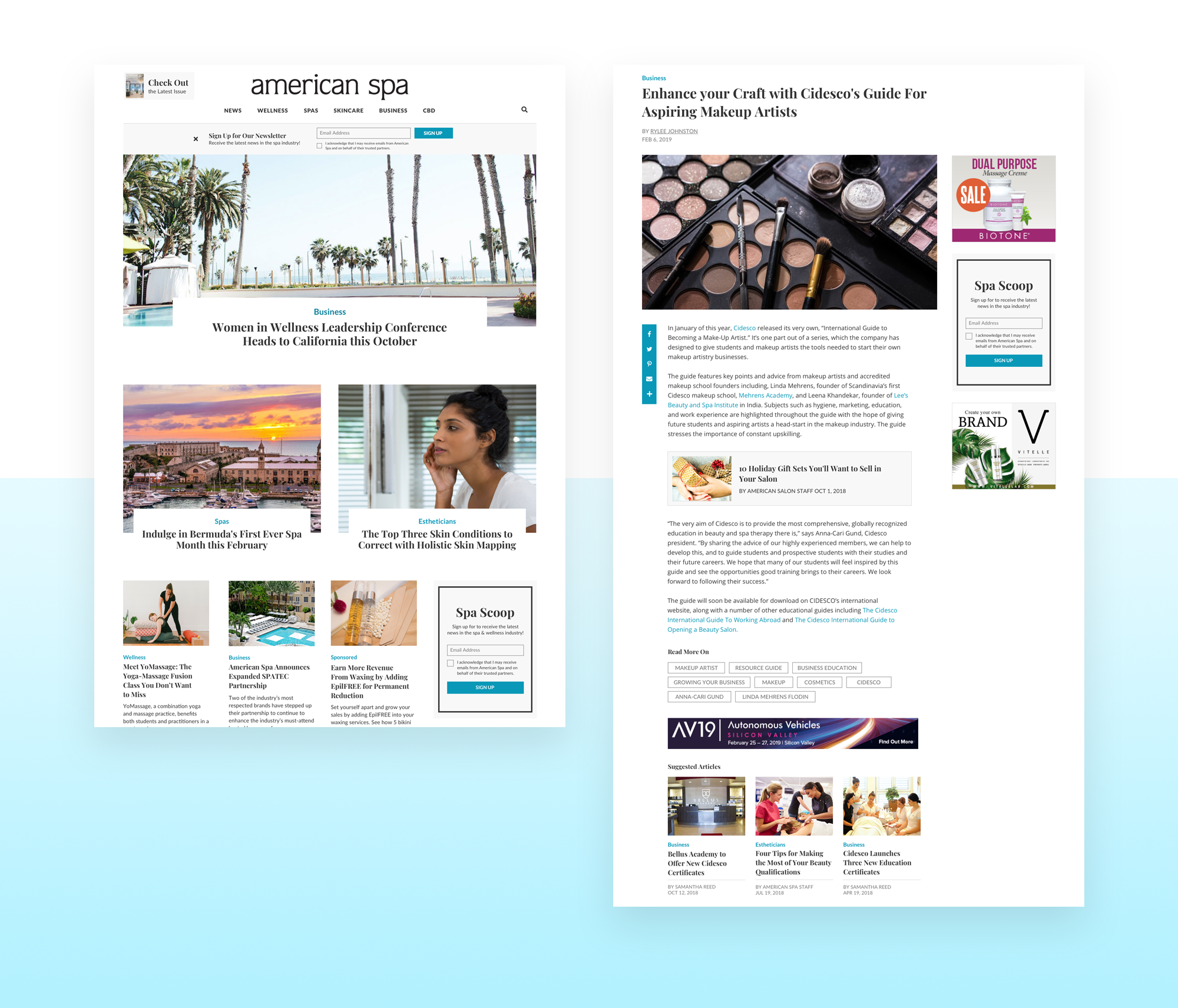
American Spa Redesign
American Spa is a site where those in the spa and wellness industry go to learn how to better their businesses. My role was to take our templated site and transform it to be more competitive within the wellness industry.

American Spa had an old-fashioned looking site that did not match up with how they wanted to be perceived. My goal was to amp up the design while also bettering our users’ experiences.
American Spa wanted to be seen as sleek, modern and elegant. Additionally, the wellness industry is visually focused. However, the old site did not portray this vision, as their site was bland and did not showcase imagery well. The images in the hero section are large in order to grab the users’ attention. I balanced the heroes with having a three column grid for our content. For desktop, most users do not make it to the end of the page so by having a 3 column grid, they can see more articles on their screen. This allows for more articles to be viewed within a given amount of space.
I also completely switched their font from a sans-serif to a serif font. Serif fonts are commonly used in the beauty and wellness industry and give off the appearance of a more sleek, modern site. Below, the old site is on the left and the new site is on the right.

Not only was this a redesign, a couple of new features were added to better engage our users and to drive more newsletter sign ups.
Once a user was finished reading an article, they had to go through too many steps in order to find another article that caught their attention. I created the “suggested articles” block which will showcase articles related to the one that they are currently reading. This will help keep users on American Spa rather than just reading an article and leaving. Due to its success at retaining users on the site, this “suggested articles” block was utilized again on all other Questex sites using our media site template.
In addition, a banner located under the navigation was introduced to drive more newsletter sign ups. The banner was less intrusive than a pop-up for our users because they have the ability to close out of it, and it does not drive them away from the page they are on. The newsletter sign up block was also added into the footer.

It was important to have a visually dynamic and easy to use mobile experience as well.
On mobile, I increased the font size and line height of the articles to make it easier to read for our viewers. An ad was added within the article body to increase the ad’s viewability as well as helping make the article appear longer so that the user continues to scroll.

You can explore American Spa yourself here.
All computer and mobile mockups were created with the help of media loot.